
 Image courtesy of anankkml/freedigitalphotos.net
 If you've ever designed a mailer, you know a lot of thought goes into it. What colors will you use? What information should you include? What picture will communicate what you need to say?
We’ll help answer these questions and more over the coming weeks in our Direct Mail series. For starters, let's zoom in on photos.
Here are some pointers to pick your perfect pic:
Get emotional.
Never underestimate the power of pathos in pictures. Building an emotional connection with your readers through compelling images is at the core of constructing a direct mail piece that sparks reaction…and more importantly, ACTION.
Aesthetically pleasing visuals help readers associate meaning without ever looking at the copy. Good writers recognize how to paint emotional appeal not just in copy, but in the brush strokes of every image, graphic, and photograph that adorns the page.
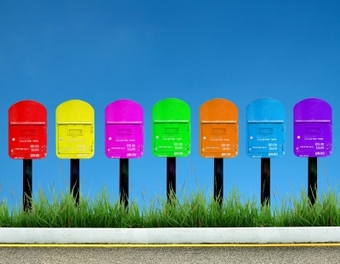
To color or not to color? That is the question.
Different color schemes can elicit different reactions from readers. While everyone carries unique perceptions, the psychology of colors has long been considered an important aspect when creating marketing collateral.
From images to logo designs, and even font style, color selection helps lead readers to one reaction or another. Know which path you want to steer readers to and select colors that mirror those objectives.
Quality is king.
The same careful attention given to crafting direct mail copy should also be given to selecting images. Like culling the right word choices or modifying modifiers, picking pictures requires a critical lens.
Tune in next week for part two of our Direct Mail series for tips on crafting creative copy.
We’ll help answer these questions and more over the coming weeks in our Direct Mail series. For starters, let's zoom in on photos.
Here are some pointers to pick your perfect pic:
Get emotional.
Never underestimate the power of pathos in pictures. Building an emotional connection with your readers through compelling images is at the core of constructing a direct mail piece that sparks reaction…and more importantly, ACTION.
Aesthetically pleasing visuals help readers associate meaning without ever looking at the copy. Good writers recognize how to paint emotional appeal not just in copy, but in the brush strokes of every image, graphic, and photograph that adorns the page.
To color or not to color? That is the question.
Different color schemes can elicit different reactions from readers. While everyone carries unique perceptions, the psychology of colors has long been considered an important aspect when creating marketing collateral.
- Do you want your readers to feel a sense of calm or excitement when they pick up your mailer? (think blue versus yellow)
- Is your goal to convey urgency or credibility? (think red versus blue)
- Are you sending a creative or clinical message? (think orange versus white)
From images to logo designs, and even font style, color selection helps lead readers to one reaction or another. Know which path you want to steer readers to and select colors that mirror those objectives.
Quality is king.
The same careful attention given to crafting direct mail copy should also be given to selecting images. Like culling the right word choices or modifying modifiers, picking pictures requires a critical lens.
- Make an investment. It’s not hard to find free photos, but that doesn’t mean they’re any good. Purchase photographs for best results.
- Aim for uniqueness. Stock photos are widely available on the web, but that means they’re also available to everyone else. Think beyond stock photos and strive for uncommon quality.
- Ensure appropriateness. Make sure each photo is appropriate and fitting to your core message and audience.
Tune in next week for part two of our Direct Mail series for tips on crafting creative copy.
 RSS Feed

